How to use data visualisation to effectively share your messages
Data visualisation can help you share crucial insights about your work in an evidenced, data-driven way. But elevating your data from a humble bar graph can be difficult. Here’s a quick look at some best practices for using data visualisation effectively.
Drawing out the story from your data
When done well, data visualisation can help you share crucial insights about your work in an evidenced, data-driven way. They can transform a dry, impenetrable stack of numbers into an intriguing and engaging story.
But, there are many hurdles to creating effective data visualisations. Is your data well-suited for visualisation? Are you using the right kind of visuals? In this short guide, we’ll take a look at some best practices for using data visualisation effectively.
1. Be brutal: is it worth visualising?
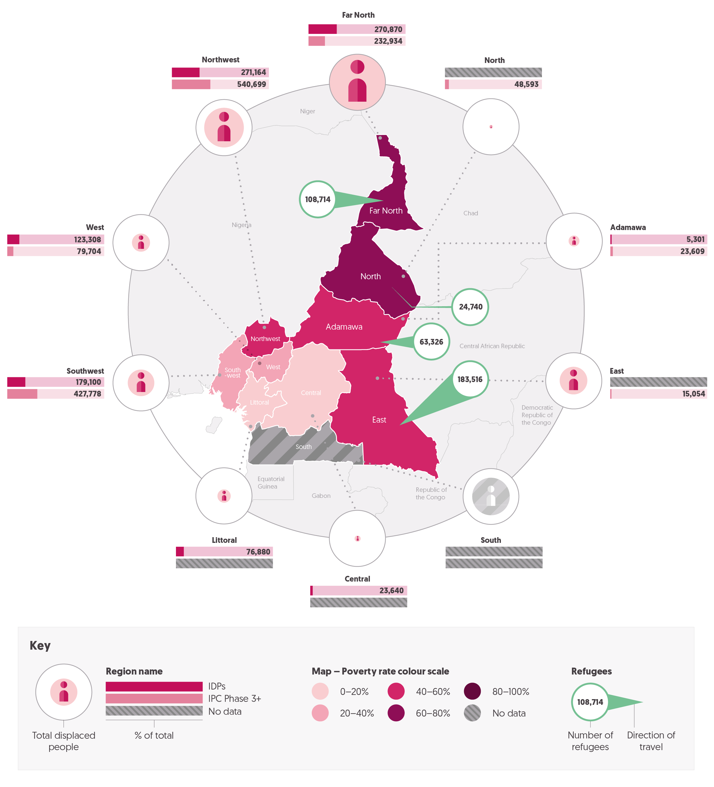
An animated chart from our work with the CALP Network
Not all data is worth visualising. Before you invest time and effort into creating a visualisation, ask yourself if it's necessary.
Why should this data be transformed into a visualisation? Does the data tell a compelling story that can't be better conveyed in a table or other format? How will the visualisation help your audience understand the data better?
If you’re struggling to justify creating it, then it might be better to skip the visualisation altogether. Remember, the goal is to communicate your message clearly and effectively, not to create a fancy graphic.
A well-designed visualisation can expand and deepen your audience’s understanding.
A poorly-designed one will just confuse and confound them.
2. Understand what you're trying to say with the data
Before you start creating your visualisation, it's important to understand what you're trying to say with your data.
What is the message you want to convey? What insights are you trying to share? This will help you choose the right type of visualisation and ensure that it accurately represents your data.
For example, if you're trying to show trends over time, a line graph might be the best option. But if you're comparing data across different categories, a bar chart might be more appropriate.
Or, perhaps you’re looking to make something which communicates using not only the data and graph type, but the way in which the two are presented. Make sure you choose a visualisation that supports your message and is easy to understand.
3. Make sure your visuals reinforce and support your message
When creating your data visualisation, you need to make sure it visually reinforces your message.
You can do this by using a colour scheme which effectively highlights or contrasts important data points; or perhaps by using graphics and images which contextualise your data.
It’s also important that your visualisation is essentially self-contained: your audience should be able to understand it with just the elements provided. This requires labelling axes and data points clearly, and using annotations and captions to provide context where necessary.
Finally, it’s crucial that you avoid clutter and unnecessary elements - these will distract from your message, and make the visualisation harder to understand.
4. Ensure your data is accurate and presented properly
This may seem like an obvious point, but it’s often overlooked.
When developing your data visualisation, it’s best to work with the final version of the data. Updating the data points further down the line can allow inaccuracies to creep in, and can distort the design.
There are also some basic conventions that you should adhere to when visualising data.
For instance, make sure it’s clear which numbers your axes start or end at, and space the intervals along them evenly - failing to do this can distort or skew your visualisation.
Whilst it may be tempting to stretch elements in order to emphasize your point, you’ll open yourself up to accusations of distorting the data which can undermine the point of using data visualisations in the first place.
5. Make it move
Adding animation to your visualisations can help bring your data to life and make it more engaging.
Whether it’s using simple animations like unfolding bar charts and line graphs, or a more complex evolution between multiple types of graph, animation can help draw attention to specific points, demonstrate relationships, and make the data easier to understand.
However, it's important not to overdo it with animation. Too much animation can be distracting and detract from your message. Use animation sparingly and only when it enhances your visualisation.
Getting started
Data visualisation is a powerful tool for communicating complex information in a clear and meaningful way. But remember, it’s essential to be clear on your motivation, and messages for the visualisation: the goal is to communicate your message clearly and effectively, not to create a fancy graphic.
At UNPACK, we’ve worked on many data visualisations for a wide range of organisations. We can help you find the story in your data, and present it in a powerful and engaging way. Want to find out more? Drop us a message, and let’s discuss your project.


